Executive Summary
For decades, investors have sought to decode the rhythm of the Federal Reserve’s policy cycle — when to anticipate the next easing, how to position across asset classes, and what signals truly precede sustainable recovery. Despite the abundance of data, one consistent truth remains: unemployment lags the Fed cycle, not the other way around. The economy weakens, the Fed cuts rates, and only afterward do labor conditions stabilize.
This temporal gap — between policy easing and job recovery — is where forward-looking investors find opportunity. Private credit and real estate markets typically outperform during the early easing stages, when valuations are still compressed but capital costs are falling. Private equity lags slightly, as deal activity and earnings growth recover more gradually, but eventually benefits from the same liquidity wave.
The following analysis, grounded in regression evidence and historical data from the Federal Reserve, dissects this classic causal chain — Jobs → Fed → Markets — across more than five decades of U.S. cycles.
1. Labor Market Stress as the Early Warning Signal

The interplay between unemployment rates and continued jobless claims has historically provided one of the clearest signals of cyclical inflection. As Chart 1 illustrates, during both the 2008 Financial Crisis and the 2020 COVID-19 shock, jobless claims surged before unemployment fully registered the downturn. The lag between claims and unemployment underscores the real-time sensitivity of claims data — a signal that economic stress is mounting while official unemployment statistics still appear stable.
Yet, even these early warnings arrive after the Fed’s policy environment has tightened materially. In each instance, by the time the unemployment rate reached its peak, the Federal Reserve had already begun cutting rates. The implication is critical: investors should not interpret rising unemployment as a cue to retreat but rather as confirmation that the policy response — and the eventual market recovery — is imminent.
Your regression estimates confirm this intuition. The impact of job claims one month before (t-1) on industrial production yields a negative coefficient of -0.01352, while monthly job claims growth shows an even stronger negative effect of -0.1352. Both coefficients suggest that as claims increase, output falters. The causality flows from weakening employment to weaker production, setting the stage for monetary easing.
2. The Fed’s Counter-Cycle: Policy as the Lead Indicator

The long historical record of U.S. monetary policy reveals that every major easing cycle was born out of labor distress. In the previous chart, which overlays the unemployment rate with the Fed Funds Rate, captures this symbiosis. The orange line — representing policy rates — consistently peaks before unemployment does.
From the inflation crises of the 1970s through the post-pandemic disinflation of the 2020s, the Fed has always followed the same playbook: tighten until inflation cools, accept rising unemployment as the collateral cost, and then cut rates to reflate demand. This lagging relationship between employment and monetary policy makes the Fed’s pivot — not labor statistics — the real inflection point for investors.
By the time the Fed begins cutting, it is signaling not only an acknowledgment of economic strain but also a commitment to liquidity support. In that moment, forward-looking markets — especially those linked to credit and real assets — tend to move ahead of improving macro data.
3. Historical Cycles: Every Modern Cut Mirrors Today’s Conditions

Peaks around 1975, 1982, 1992, 2009, and 2020 correspond precisely to Fed rate-cutting cycles. Each time, unemployment surged after the Fed’s tightening phase and began declining only months after policy had already turned accommodative.
In early 2025, with unemployment near 4.3%, the U.S. stands at a familiar juncture. Growth is softening, inflation pressures have moderated, and capital costs remain historically high after two years of aggressive tightening. The Fed is once again approaching the end of its restrictive stance. The resemblance to prior cycles — notably 1989, 2001, and 2019 — is striking.
If history holds, this phase marks the beginning of a favorable window for investors who position into rate-sensitive assets before the labor market fully catches down to slower growth. Unemployment’s rise confirms the slowdown but also foreshadows rate relief and renewed liquidity.
4. Job Claims: A Lagging but Potent Reflection of the Cycle
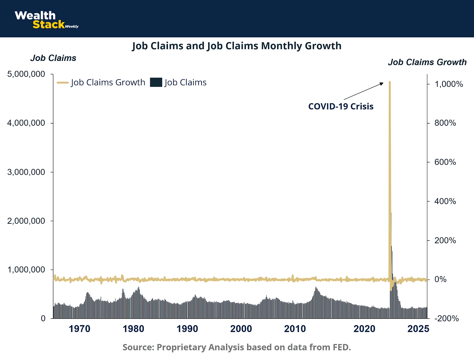
The chart above, spanning five decades of job claims data, vividly captures the cyclical nature of labor distress. The towering spike during the COVID-19 crisis — exceeding 1,000% growth — represents an extreme anomaly, but it reinforces the structural truth: job claims respond dramatically once demand collapses and businesses begin adjusting payrolls.
Outside of crisis episodes, claims oscillate within narrow bands, only breaking upward when the Fed’s prior tightening phase has fully filtered through the real economy. This delayed reaction explains why claims growth is such a powerful coincident indicator of recession — but a poor leading indicator for markets.
In quantitative terms, the impact of job claims growth in economic activity (-0.00248) and unemployment growth in economic activity (-0.00392) underline this point: both negatively correlate with GDP-like measures of activity, but their effects materialize late in the downturn. Investors waiting for these data to confirm a slowdown typically miss the first leg of market recovery that begins when the Fed starts cutting.
5. The Cost of Capital: The Real Driver Behind Industrial Cycles
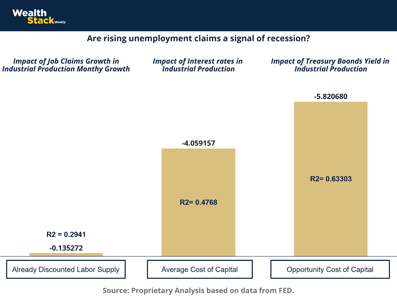
Industrial production responds less to labor changes than to capital conditions. The chart above, derived from our regression framework, demonstrates how interest rates and Treasury yields dominate the explanatory power behind production trends.
The estimated coefficients — -4.059 for Fed interest rates and -5.820 for 10-year Treasury yields — reveal that increases in borrowing and opportunity costs have a far greater contractionary effect than rising job claims alone. The R² values, ranging from 0.47 to 0.63, confirm that capital costs explain roughly half or more of industrial performance variance.
This insight is vital for investors: while employment weakness captures headlines, the underlying economic throttle remains monetary in nature. The Fed’s cost of capital decisions shape corporate margins, investment appetites, and ultimately asset prices. The downward adjustment in rates, once initiated, typically unleashes a powerful reacceleration in industrial output — and by extension, risk asset valuations.
6. Translating Fed Policy into Real Economy Recovery
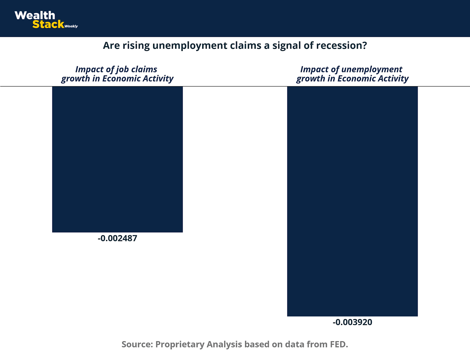
This chart translates these dynamics into the broader sphere of economic activity. Both job claims and unemployment growth exhibit modest negative effects on overall economic performance. The coefficients of -0.00248 and -0.00392 quantify how employment deterioration constrains aggregate output.
However, the key takeaway is not the size of these effects, but their timing. They manifest after policy conditions have shifted, reinforcing the notion that real economic recovery begins while employment data still deteriorate.
Investors who grasp this lag are able to reposition portfolios while public sentiment remains pessimistic. In practice, this means buying credit and real assets at valuation troughs, before unemployment data visibly improve. This contrarian posture, grounded in historical precedent, consistently outperforms over full cycles.
7. Housing: The Transmission Mechanism of Monetary Policy
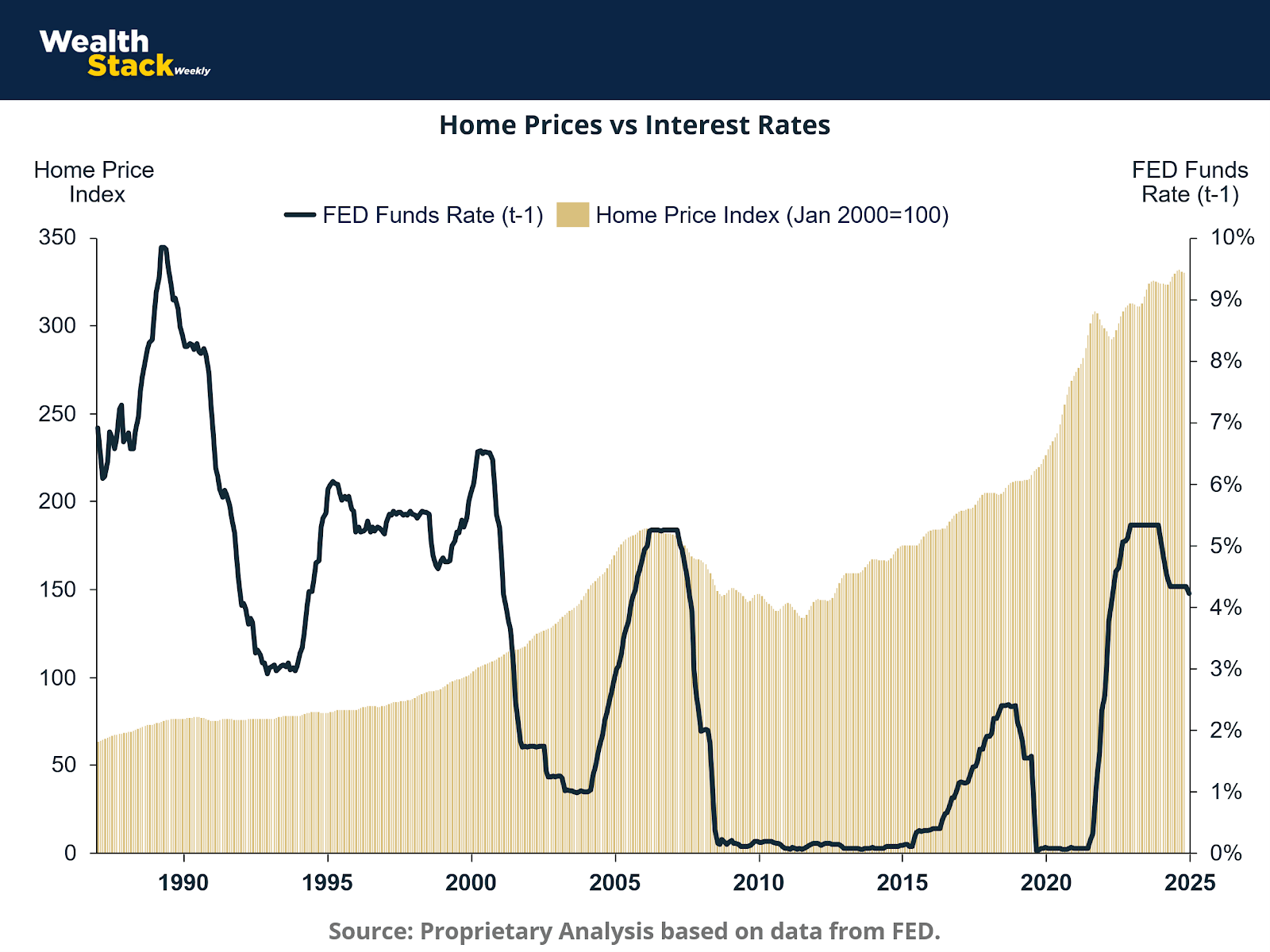
Among all real economy components, housing exhibits the most direct and immediate response to monetary policy. This chart tracks the inverse relationship between the Fed Funds Rate and the Home Price Index since 1990. Each period of rate easing — notably the early 1990s, post-2001, post-2008, and post-2020 — sparked a pronounced recovery in home prices within months.
This cyclical symmetry arises because housing links financial conditions to household wealth and consumption. A single rate cut ripples through mortgage markets, refinancing incentives, and construction activity. Your econometric findings validate this connection: the impact of interest rates on housing prices (-13.06) demonstrates substantial elasticity, while the Probit coefficient (0.3009) indicates a 30% higher probability of housing price increases one month after a Fed rate cut.
The implication for investors is clear: real estate is not just sensitive to monetary shifts — it is the first sector to price them in. Historically, housing markets have bottomed within a quarter of the final rate hike, often preceding the broader equity rebound.
8. Housing Momentum and the Fed’s Forward Guidance
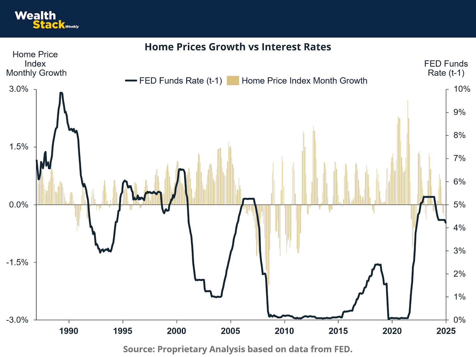
Here, the relationship with interest rates is even clearer: periods of declining Fed Funds Rates coincide almost immediately with positive inflections in home price growth.
In the 1990s and mid-2000s, easing cycles triggered sustained appreciation lasting several years. Following the 2008 crisis, an extended period of near-zero rates drove one of the longest housing booms in modern history. More recently, after the pandemic-era surge and subsequent correction, the 2024–2025 setup again positions housing as a leading beneficiary of potential rate normalization.
For credit investors, this represents fertile ground. As mortgage yields decline, collateral values strengthen, and default probabilities fall. This dynamic benefits private credit funds and real estate-backed lending strategies, where yield compression and improving asset quality intersect.
9. Reassessing the Interest Rate Impact on Housing Dynamics
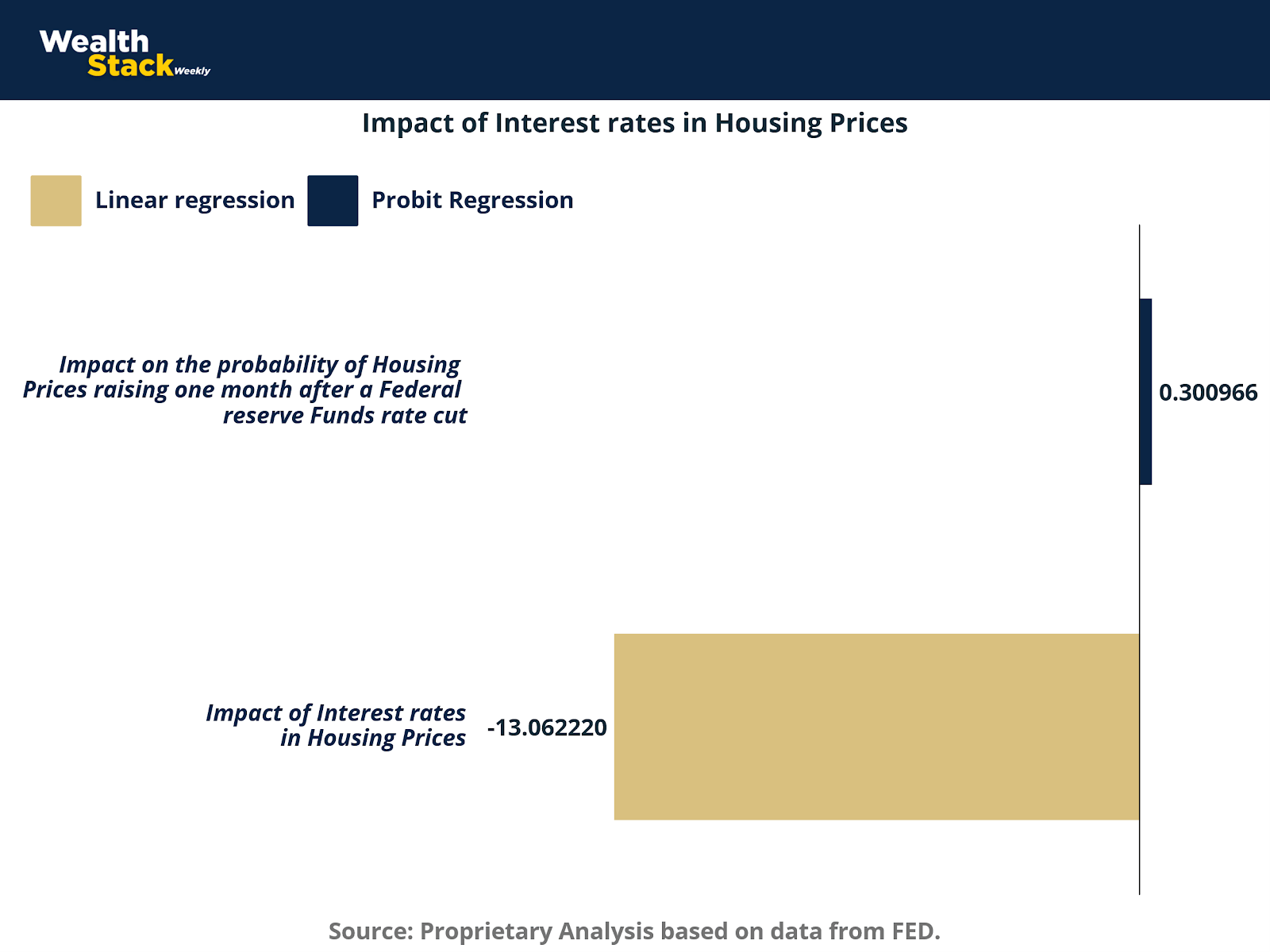
This graph quantifies the magnitude of interest rate effects across both linear and Probit models. The OLS result (-13.06) confirms that rate increases suppress housing prices sharply, while the Probit outcome (0.30) captures the asymmetric probability of a rebound post-cut.
For investors, this evidence affirms that rate cuts are not merely stimulative in theory but predictive in practice. Within one to two months of a policy pivot, the probability of housing price gains rises meaningfully — often well before broader indicators of economic improvement.
Real estate thus functions as the earliest and most visible transmission channel of monetary policy into tangible asset performance. It also signals the start of a broader re-rating across risk assets, typically spilling over into credit markets first and equities later.
10. The Investor’s Playbook: From Credit to Equity
The cyclical evidence across these charts reveals a consistent ordering of opportunity. When the Fed transitions from tightening to easing, private credit and real estate capture the first wave of return potential. Lower policy rates reduce default risk, improve loan coverage ratios, and enhance valuations. Credit spreads remain wide in the early phase, providing attractive yields even as underlying fundamentals begin to recover.
Real estate, buoyed by refinancing flows and increased transaction activity, begins to re-rate almost immediately. As inflation pressures subside, property cap rates compress, driving total returns that often exceed public market performance.
Private equity, however, operates with a longer lag. Deal activity, leverage availability, and exit valuations depend on sustained stability in funding costs and investor sentiment. Consequently, PE funds tend to underperform during the transition but outperform strongly in the later recovery phase once growth resumes and discount rates fall.
This sequencing — credit first, real estate second, private equity third — has held true across the past five Fed easing cycles and appears poised to repeat once more.
11. The Present Context: Echoes of Earlier Pivots
In 2025, the macro environment bears remarkable resemblance to pre-easing conditions of prior decades. Growth has cooled, labor markets are softening, inflation expectations are anchored, and financial conditions remain restrictive. The Fed faces mounting pressure to normalize policy without reigniting inflation.
Against this backdrop, investors stand at the inflection point between late-cycle tightening and early-cycle easing. As Chart 7 earlier illustrated, the unemployment rate tends to crest after the first rate cuts occur. This lag ensures that pessimism remains elevated just as conditions begin to improve beneath the surface.
Recognizing this dynamic is essential. Each prior easing phase — from 1982 to 2020 — rewarded contrarian positioning in credit, housing, and value-oriented equities. Those who waited for the unemployment rate to decline consistently entered the market late.
12. The Classic Sequence Reinforced
Taken together, the regression results and historical charts reconstruct the same macro narrative across half a century:
Employment weakens as prior rate hikes filter through the economy.
Industrial production slows sharply as capital costs rise.
The Fed responds by cutting rates, restoring liquidity and credit confidence.
Housing prices and private credit recover first.
Broader equity and private equity markets follow as earnings rebound.
This timeless progression — Jobs → Fed → Markets — is not a theory but a recurring empirical pattern. The negative coefficients on job claims and interest rates within industrial and economic activity models encapsulate the fundamental driver: capital costs dictate output, and output dictates employment.
13. Reading the Fed’s Signal
For the forward-looking investor, the key is not predicting the precise timing of rate cuts but recognizing the phase of the cycle. As unemployment edges higher and job claims accelerate, the Fed’s calculus shifts decisively from inflation control to growth stabilization. Once this pivot begins, liquidity conditions loosen, and the market’s discount rate falls.
At this stage, private credit offers high current income with declining risk, real estate begins to reflate, and private equity prepares for a valuation expansion cycle.
Unemployment may continue to rise for several months, but as history shows, by the time it peaks, the best entry points have already passed.
Conclusion
Economic history rarely repeats perfectly, but it rhymes with uncanny regularity. The 2025 macro setting mirrors countless prior moments when investors faced uncertainty, slowing growth, and elevated policy rates — only to witness a sharp reversal as the Fed pivoted.
Every major easing cycle has reinforced the same message: unemployment lags policy, not the other way around. The Fed’s first cut marks the turning of the tide, not its aftermath.
For those willing to interpret rate signals through this lens, the investment roadmap is clear. Private credit and real estate stand to outperform first, harnessing the benefits of lower financing costs and stabilizing fundamentals. Private equity, while slower to respond, ultimately compounds those gains as growth normalizes.
The classic sequence — Jobs weaken, the Fed cuts, and markets recover — remains the most reliable compass in modern macroeconomics. Understanding it not only clarifies where we are in the cycle but reveals where the next opportunities lie.
Sources & References
Board of Governors of the Federal Reserve System (US), Federal Funds Effective Rate [DFF], retrieved from FRED, Federal Reserve Bank of St. Louis; https://fred.stlouisfed.org/series/DFF, November 5, 2025.
Board of Governors of the Federal Reserve System (US), Market Yield on U.S. Treasury Securities at 10-Year Constant Maturity, Quoted on an Investment Basis [DGS10], retrieved from FRED, Federal Reserve Bank of St. Louis; https://fred.stlouisfed.org/series/DGS10, November 5, 2025.
Board of Governors of the Federal Reserve System (US), Industrial Production: Total Index [INDPRO], retrieved from FRED, Federal Reserve Bank of St. Louis; https://fred.stlouisfed.org/series/INDPRO, November 5, 2025.
S&P Dow Jones Indices LLC, S&P CoreLogic Case-Shiller U.S. National Home Price Index [CSUSHPINSA], retrieved from FRED, Federal Reserve Bank of St. Louis; https://fred.stlouisfed.org/series/CSUSHPINSA, November 5, 2025.
U.S. Bureau of Labor Statistics, Consumer Price Index for All Urban Consumers: All Items in U.S. City Average [CPIAUCSL], retrieved from FRED, Federal Reserve Bank of St. Louis; https://fred.stlouisfed.org/series/CPIAUCSL, November 5, 2025.
U.S. Bureau of Economic Analysis, Gross Domestic Product [GDP], retrieved from FRED, Federal Reserve Bank of St. Louis; https://fred.stlouisfed.org/series/GDP, November 5, 2025.
U.S. Bureau of Labor Statistics, Unemployment Rate [UNRATE], retrieved from FRED, Federal Reserve Bank of St. Louis; https://fred.stlouisfed.org/series/UNRATE, November 5, 2025.
U.S. Bureau of Labor Statistics, Consumer Price Index for All Urban Consumers: All Items in U.S. City Average [CPIAUCSL], retrieved from FRED, Federal Reserve Bank of St. Louis; https://fred.stlouisfed.org/series/CPIAUCSL, November 5, 2025.
World Bank, Inflation, consumer prices for the United States [FPCPITOTLZGUSA], retrieved from FRED, Federal Reserve Bank of St. Louis; https://fred.stlouisfed.org/series/FPCPITOTLZGUSA, November 5, 2025.
Premium Perks
Since you are an Wealth Stack Subscriber, you get access to all the full length reports our research team makes every week. Interested in learning all the hard data behind the article? If so, this report is just for you.
Want to check the other reports? Visit our website.


