Hi {{first_name}},
I like to say to my research team, “If our thesis can’t be summarized in a single chart, we need a new thesis.”
At the beginning of this year we set out to create the largest private market newsletter in the world for accredited investors, and looking at what empirical evidence could tell us about expanding our investments into alternatives. We knew powerful data visualization would be critical to our success.
Currently, we are over 160k strong and our momentum suggests we’ll hit 1 million readers by the end of Q1 2026. We are humbled and grateful for your engagement.
Thank you. You make the work worth it.
In this issue, we’re pulling out the 5 most meaningful charts we published in 2025 (and maybe I threw in a bonus 6th chart at the end).
These visuals represent ideas that kept resurfacing as we reviewed capital flows, cycles, and portfolio behavior across public and private markets over the past year.
They reflect a mix of structural truth, capital behavior, how volatility is experienced, what we can learn from prior cycles. Together, they show where ownership tends to concentrate when investors optimize for compounding rather than visibility.
I hope you enjoy this snapshot in front of a large fireplace, surrounded by family.
Let’s dive in,
— Walker Deibel
WSJ & USA Today Bestselling Author of Buy Then Build
Founder, Build Wealth

TOP CHARTS OF 2025
A breakdown of the charts that shaped investor thinking this year.
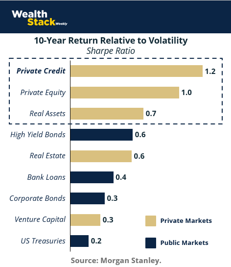
#1: Illiquidity Pays Superior Risk-Adjusted Returns
This chart captures something simple: the premium investors pay for liquidity is volatility. The Sharpe ratio measures how much return an investor earns for each unit of volatility. Higher numbers reflect more efficient compounding. Lower numbers signal a rougher path to the same outcome.
Sharpe ~0.2–0.3 reflects a bumpy ride for the return delivered
Sharpe ~0.4–0.6 is acceptable, but volatile
Sharpe ~0.7–1.0 represents strong risk-adjusted performance
Sharpe >1.0 signals exceptional efficiency, typically driven by structural or illiquidity-based advantages
Over long periods, public equities tend to sit around a Sharpe ratio of 0.3–0.4. Returns can be compelling, but volatility remains a constant companion.

Private credit and private equity have historically delivered higher Sharpe ratios by design. Assets are held through full cycles. Pricing follows operating results rather than daily sentiment. Capital compounds with fewer forced decisions along the way. You’ll notice VC’s spot on the list – it’s volatility is precisely why it’s not an asset class we cover often. At Wealth Stack Weekly, we favor downside risk protection.
Sharpe captures the difference between earning returns and living through them.
#2: Private Markets Are Cool By Design
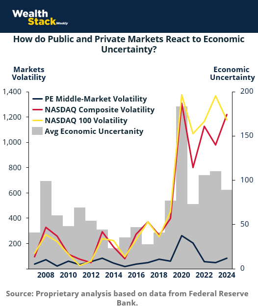
If the Sharpe ratio illustrates the results, the next chart shows us the the behavior that drives them: public and private markets behave fundamentally different when uncertainty rises.

Public equities are hot, they respond immediately. Volatility spikes as prices adjust to headlines, policy shifts, and sentiment, often well before underlying fundamentals change. Liquidity is featured as speed, but it cuts both ways.
Private markets are calmer, cooler. They move differently. Middle-market private equity shows far less volatility across periods of stress, including 2008 and 2020. Assets aren’t repriced daily. Progress is measured in operating results, not headline reactions or Wall Street plays. Capital stays focused on execution.
Isn’t that nice?
The distinction isn’t about avoiding risk altogether, just how it’s expressed and dealt with.
In illiquid investments, uncertainty is absorbed through time, structure, and operational control.
Stocks react while alts execute. Remember: volatility destroys wealth.
#3: The $10 Trillion Succession Wave
I just couldn’t leave out this chart since I actually wrote the bestselling book on the topic. By the end of the decade, trillions of dollars worth of privately held, founder-led businesses will change hands in one of the largest ownership transitions in history. This represents an enormous opportunity for entrepreneurs and LPs.

These companies generate cash flow, employ millions of people, and make up almost half the U.S. economy. Most are not venture-backed. Most are not public. And most are sold in private transactions.
But what really matters here is the structure of this opportunity.
These businesses tend to be stable, profitable, and under-optimized. Value is created through continuity, operational improvement, and thoughtful capital. Not financial engineering. Returns come from stewardship over time, not rapid repricing.
For investors with access to private markets, this transfer represents something rare: a long-duration supply of productive assets priced for transition rather than perfection.
Ownership is moving. Let the next wave of value creation begin.
#4: When Technology Sprints, Infrastructure Lags
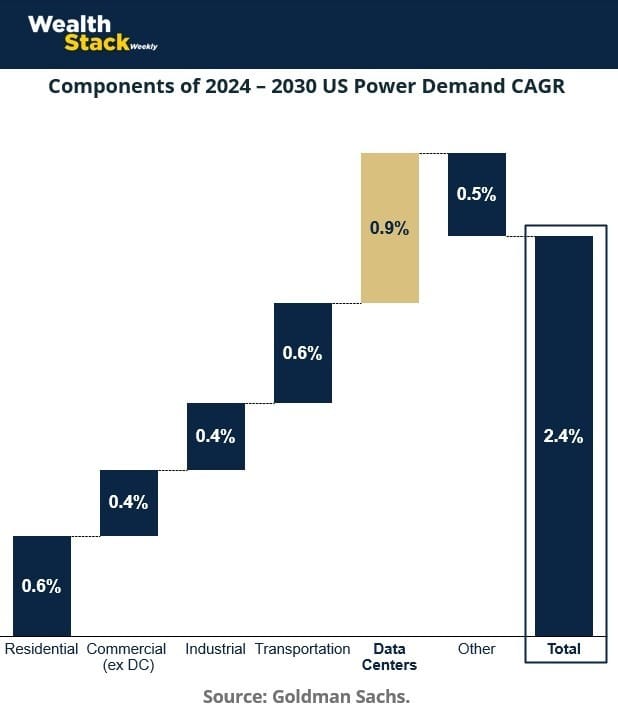
We loved this chart because it highlights the pattern that fueled the largest Build Wealth fund to date: BuildEnergy I.
The thesis is based on the empirical evidence: that the demand for new tech accelerates faster than the systems built to support it.

Technology adoption moves in weeks and months. Infrastructure moves on multi-year timelines. The gap between the two has widened again, this time around energy, power distribution, and physical capacity. EV adoption, AI compute, and data-center growth are pushing demand curves sharply higher. The underlying infrastructure is struggling to keep pace.
That mismatch creates friction for adoption, but it also creates opportunity.
Infrastructure is capital-intensive, slow to build, and difficult to scale overnight. Those constraints make it a natural fit for private markets. Returns come from owning and upgrading essential systems, not from predicting which application wins next.
When demand outpaces capacity, value accrues to the assets that supply it.
#5: The Fed Moves Before Jobs Recover — Cycles Reward Early Capital
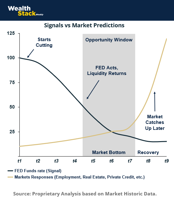
To round out this list, here is a look at a consistent pattern seen across multiple economic cycles.

It used to be that job creation and stock market performance moved in sync. Today monetary policy turns before the labor market heals. Rate cuts tend to arrive while unemployment is still rising, not after it has peaked. By the time job growth feels secure again, financial conditions have already shifted.
That timing matters for investors.
Assets tied closely to the cost of capital respond first. Private credit, real assets, and interest-sensitive strategies begin to benefit as conditions ease. Pricing adjusts quietly, well before confidence returns to the broader market.
Improved labor data confirms the cycle after it’s happened.
Capital that moves early, gains access to higher yields, wider spreads, and better entry points, while investors that wait for clarity arrive after those conditions have already changed.
It’s often said it’s time in the market, not timing of the market. But that’s for retail investors who are dollar-cost averaging into stocks for over 40 years. If you’re making entrepreneurial investment plays, the macro-cycles are your edge.
BONUS! #6 - Private Markets Are Entering a Growth Phase
I couldn’t wrap up this issue on the top charts of the past year without showcasing this one representing the projected expansion of private markets over the next several years. More than $2 trillion in new capital is expected to flow into private credit, private equity, and real assets.

The drivers behind that growth are structural. Public markets have become larger, faster, and more correlated. At the same time, private markets have grown more accessible, more transparent, and easier for individual investors to evaluate and underwrite.
It’s a need investors have and their capital has followed that shift in structure.
Institutions were early adopters. Family offices built on that foundation. Today, sophisticated individuals are increasingly allocating with purpose, drawn to assets defined by cash flow, control, and longer holding periods.
This environment is the backdrop for why I started Wealth Stack Weekly with the goal of being the largest private investing newsletter on the planet. The focus is on helping investors learn how to position as private markets move toward the center of portfolio construction.
Private markets are taking on a larger role in portfolios designed for durability over time.
Did this land in your inbox via a friend or colleague? Subscribe to get your own weekly insight into private markets.
Already a reader? Help other investors open their eyes to the private markets and forward this to someone who would value the insight. Or hit reply to tell us what you think.

